
Made for
Rekizane
My role
Product Designer
Timeline
2 Months
Responsibilties
Design Direction, Research, Interaction Design, Visual Design, Prototyping
Overview
The Product
Rekizane is an e-commerce platform designed for busy professionals in Abuja, Nigeria. It simplifies shopping by connecting users with popular stores in the city, allowing them to order products for convenient delivery, saving them valuable time and effort. With a focus on speed, convenience, and a curated selection of stores, Rekizane aims to become the go-to solution for time-pressed shoppers in Abuja, with plans to expand to other Nigerian regions in the future.

The Challenge
Navigating the Urban Maze of Roommates and Rentals
The brief I got from the test details I was provided for Roomie outlined a clear need for a solution that simplifies the process of finding and living with a roommate in Lagos, especially considering the rising urban population and the shift in average marriage ages. This context set the stage for Roomie, but digging deeper into the urban fabric of Lagos revealed additional layers to the challenge:
Compatibility Complexities
In this mixed breed, getting individuals together based on lifestyle, habits, and likes were to be ensured. How will roommates be ensured not to become housemates but comrades?
Trust and Safety Concerns
Using strangers' lend-out to also share your living space, how else could you go about a populated urban environment making its inhabitants feel safe as well as building trust? How do we go about actually establishing an environment that makes these people feel safe and also that creates that element of trust that is really needed?
Financial and Logistical Barriers
There's usually a lot of friction on the financial end of shared living, especially when it comes to bill management and splitting costs such as rent. How do we make these processes easier to avoid conflicts that arise from the same?
Diverse User Needs
A wide range of users' preferences and needs in a city like Lagos, where housing needs are different from North to South, were such a big challenge. How do you design an all-around solution appealing and meeting the needs of diverse millennials?
Market Saturation and Differentiation
With the multitude of offerings existing in the housing market, having a point of differentiation that stands out along with an offering that provides a fairly different user-friendly experience was key. How is Roomie going to provide differentiation within the market saturation?
I wanted to create a solution that not only meets but exceeds the expectations of urban dwellers in their quest for the perfect living situation.
The Process
A Personal Expedition in Understanding Housing Challenges
I could not follow up with a formal workshop, so I resorted to some impromptu ways and approached my friends and colleagues on WhatsApp. It was in this virtual space that I found a lot of experiences and nuggets. Every chat box brimmed with stories on both house searches as well as between the interactions of future flatmates. Every conversation was a window to the varied needs and aspirations of all potential students, juggling budgets to young professionals hoping to find comfortable living spaces.
Based on the information from the Roomie app target market and the associated research, here are three distinct personas:

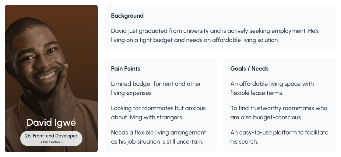

These chats revealed the laughter and frustrations of the breathing urban living experience. I would listen to firsthand experiences of how difficult it was sourcing for suitable roommates and good apartments, and this gave me the opportunity to taste from the broader issues faced by residents in Lagos rather than access life through the normal issues foreigners face.
My own arduous experience in looking for an apartment in Lagos greatly shaped my perspective, taking me four grilling months, dealing with numerous agents, and viewing countless unsuitable apartments. This personal struggle really laid bare the continuous inefficiency and opaqueness of the current system.


Our Approach
Branding & Design
In designing Roomie, I carefully selected teal as the primary color and coral as the secondary to evoke feelings of tranquility and warmth, reflecting the app's aim to make the roommate search process both calm and optimistic. The logo, featuring a house with two keys shaped like people, symbolizes Roomie's dual focus on finding not just a place to live but also a compatible person to share it with. I chose the Urbanist font for its modern and accessible feel, ensuring that Roomie's interface is user-friendly and inviting. These choices are deeply connected to Roomie's mission, aiming to visually communicate the app's values and goals, creating a cohesive brand experience that resonates with users.


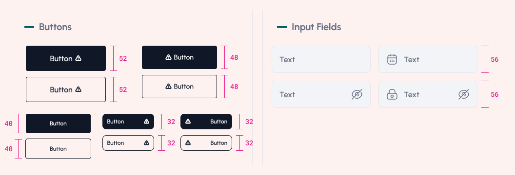
I ventured into the design, taking on the challenge to bring Roomie to life. My journey, fueled by extensive research and user-focused insights, aimed to unravel the complex puzzle of crafting an intuitive and engaging roommate-finding experience. Delving into the unique needs of urban dwellers and the intricacies of compatibility, each step represented a thorough immersion into the essence of design thinking.
Viola!

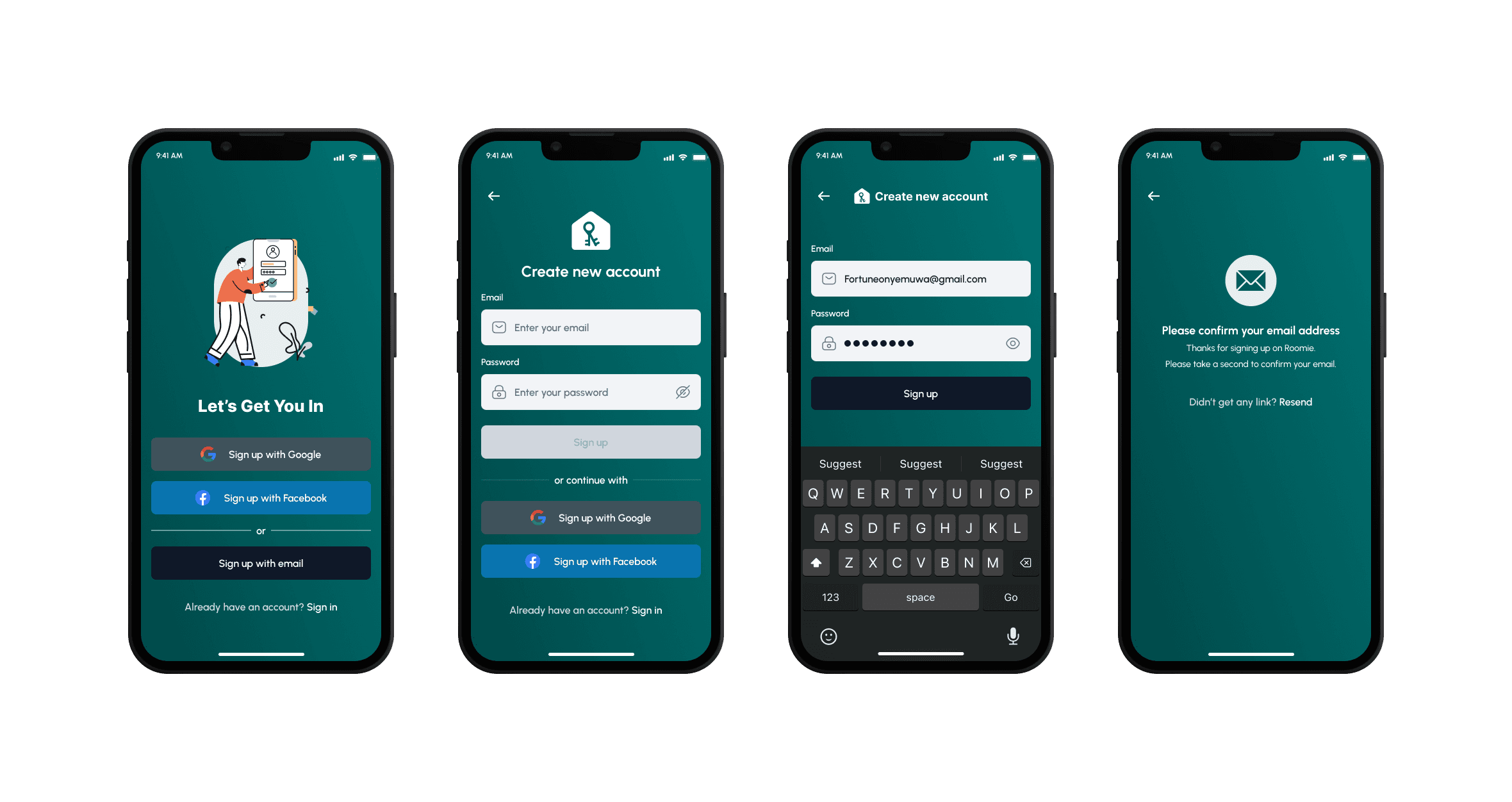

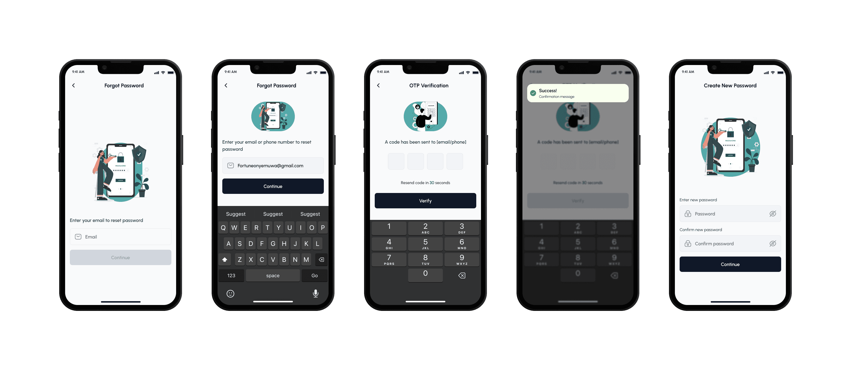


Exploring Roomie
Each screen is a blend of functionality and aesthetics, intended to make your Roomie experience not just efficient but also enjoyable.


Adding a Listing

Chatting / In-app Calls
